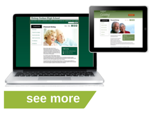
The Secret Sauce of Our Marketing Services Websites
“A designer knows he has achieved perfection not when there is nothing left to add, but when there is nothing left to take away.”
- Antoine de Saint-Exupéry
The best-designed products, like Apple’s iPad and the Swiss army knife, are deceptively simple. Yet to arrive at the iPad interface, years of planning, development, and rejected designs contributed. For the user, it’s unfussy and easy-to-use, but there’s a lot more going on under the hood than meets the eye.


When we set out to build the platform and design template for our Marketing Services websites, we wanted to do it right. We wanted to achieve the best possible experience for your donors, and for our customers. Here’s a look behind the curtain at the principles that guided our process.
UX: Start building with the End User in Mind
User Experience (UX) is the art of delivering a positive experience to website visitors, making it easy for visitors to find the information they seek, or the answers to their questions. A good user experience is powerful; visitors leave your site with the information they need, and feeling successful. Conversely, a bad UX leaves visitors confused, unsatisfied, and unlikely to return to your site. Because end-user perception is the key to a good website, we didn’t spare anything to get it right.
Planned giving concepts can be complicated, so we wanted to ensure our website content was easy to digest. We consulted with a nationally respected UX expert on the best way to organize content on the site to optimize comprehension and engagement. We needed to make it easy for visitors to find the information they were seeking, without overwhelming them. We optimized site organization, minimizing the number of clicks required to find content.
Once we had the content framework, or information architecture, in place, we enlisted a prominent Boston design firm to create the page templates and visual layouts. In order to integrate seamlessly with our clients’ main sites, the designs had to work equally well with any color palette or font scheme. I have overseen many website projects for both nonprofit and for-profit organizations, and it really makes sense to give the designers certain parameters about what information goes on the pages and have them make it pretty. The use of white space is as important as the font choice, and the size and shape of the buttons and the placement of the calls to action are all intentional.
The next step in the process was bringing in the developer to build the engine that powers the sites. We hired a software firm that specialized in building digital platforms, to create a user-friendly, highly customizable web site. We told them our customers needed the ability to edit all content on the site, on an on-demand basis. They also re-programmed GiftCalcs, our interactive online gift calculator (the designers had already given the product a sleek new look), and made dynamic gift annuity rate tables that are updated automatically every time they are rendered on the page.
Design for Flexibility
Websites need to be updated constantly (that’s the beauty of the World Wide Web), and we designed our Marketing Services website platforms to accommodate those needs. Our content management system lets you edit content on any page. Clients receive their own logins to the portal, so you can make changes the moment they’re needed. But if you prefer, you can call/e-mail/fax us with changes and we’ll do them for you.
Similar to site content, website design changes on an ongoing basis. Typically, website redesigns are costly, and can cause major upheaval in planned giving departments using an outside vendor for their website. To address this, our proprietary technology automatically matches the branding and look and feel of your parent site throughout any changes. There’s minimal work on your part, and we don’t charge you for redesign. This ensures that your website will remain up-to-date ongoing.
Listen to User Feedback
For nearly as long as there’s been a PG Calc, clients have been telling us what they would want in an online presence. In fact, we have overseen the creation of custom websites for multiple consulting clients. In considering how to make affordable, personalized websites, I was able to tap into that wealth of suggestions and requests.
Another critical phase of building a website is Usability Testing. We took our site to a lab and videotaped donors of different ages who knew little or nothing about planned giving, and cherished their feedback.
One of the biggest insights that came out of the focus groups was where to place the Why Give section. This is one of the most important pieces of content on a planned giving website because it states how a planned gift will help further your organization’s mission. A donor suggested that this content should be integrated within pages on specific planned giving vehicles, e.g. on the gift annuity page. This way, the moment a prospect decides which planned gift may be right for him/her, the mission specific-information reinforcing giving is front and center.
This feedback was vital to our website building process, and helped improve our websites.
Curious how your website is performing? Schedule an evaluation of your planned giving website.


Submit a Comment